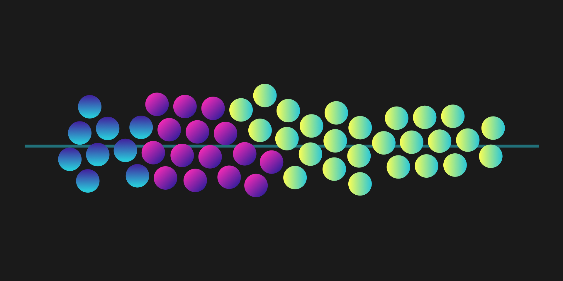
Beeswarms in Svelte 5 + D3
Beeswarms may be one of my favorite charts. They’re good at showing the distribution of data while still keeping the granularity of each item in your dataset. Beeswarms are Strip plots but with a special layout that makes it easier to see each circle.
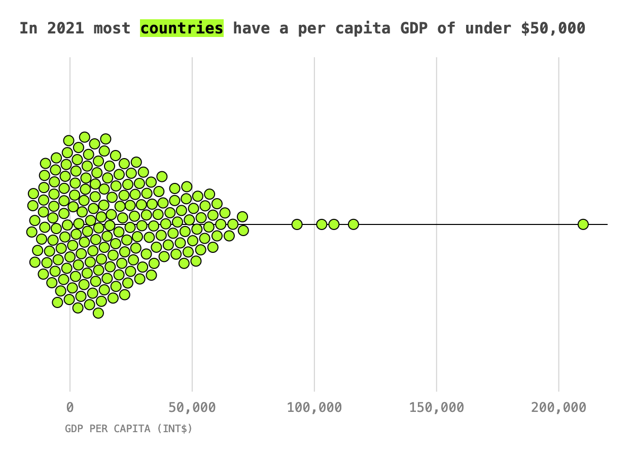
This is the chart we’ll be building, it’s a visualization of the 2021 Gapminder GDP per capita dataset:
D3 has a handy function that can do all the math for you and figure out how to place all these circles without overlapping: the force simulation.
I’d recommend this writeup for a good explanation of the different elements of a force simulation.
Most examples I found online were written for D3 in vanilla JS, or in the Svelte world, were written before Svelte 5 introduced the concept of runes. So this is my approach to implementing a beeswarm plot using D3 in Svelte 5 - there might be (probably are) better ways to do this, but this is what worked for me!
Setting up the strip plot
To start let’s get a basic strip plot working. In our <script> tag we can setup our basics.
<script>
  import * as d3 from "d3";
  let { data, xVal } = $props();

  let margin = { top: 20, right: 20, bottom: 50, left: 50 },
    width = 600,
    height = 400,
    radius = 5;

  const innerWidth = $derived(width - margin.right - margin.left);
  const innerHeight = $derived(height - margin.top - margin.bottom);

  const xAccessor = (d) => d[xVal];
  const xScale = $derived(
    d3.scaleLinear().domain(d3.extent(data, xAccessor)).range([0, innerWidth])
  );
</script>
Here I’m using $derived() to wrap any value that depends on state, in this case, my xScale depends on the data prop, which will be empty initially until the data is loaded in the parent component.
Then we can set up the page contents:
<svg {width} {height}>
  <g transform="translate({margin.left},{margin.top})">
    <!-- Draw axis lines first so circles render above -->
    <g transform="translate(0, {innerHeight / 2})">
      <line x2={innerWidth} stroke="black" />
    </g>
    <!-- Draw circles -->
    {#each data as dot}
      <circle
        cx={xScale(xAccessor(dot))}
        cy={innerHeight / 2}
        r={radius}
        class="Dot"
      />
    {/each}
  </g>
</svg>
Finally with a little styling…
<style>
  .Dot {
    fill: greenyellow;
    opacity: 0.5;
    stroke: black;
  }
</style>
We get a strip plot! I skipped any extra peripherals such as an axis or tick marks, for now, we’ll get to those at the end.
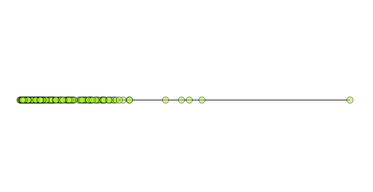
This is already interesting as it is; we can start to see the areas of highest density and the general spread. But it’s hard to get beyond that general impression.
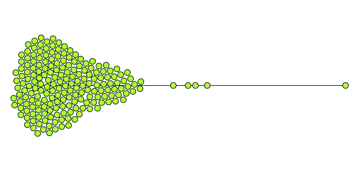
Adding a force simulation
So now let’s do the fun part!
The actual force simulation setup is standard, it’s the same that we would do in a vanilla D3 chart.
d3.forceSimulation(data)
      .force("x", d3.forceX((d) => xScale(xAccessor(d))).strength(0.4))
      .force("y", d3.forceY(innerHeight / 2).strength(0.1))
      .force("collide", d3.forceCollide(radius + 1))
      .stop()
      .tick(200);
A lot of these values, the x force (0.4), the y force (0.1), and the number of times the simulation should run (200) - are all sort of “magic numbers”. You might have to tweak them a bit to get it right for your data.
But where does this go in Svelte?
If you’re curious to know what d3.forceSimulation is doing I’d recommend taking a look at their docs. One thing that I noticed when reading these was the following note:
WARNING
This function is impure; it mutates the passed-in nodes.
This can give us a pointer as to how to implement this in our code. Given that the simulation wants to modify the nodes directly, let’s create a copy of our nodes (aka our data), let the simulation run, and then use those modified nodes to render the circles.
This can also give us a hint as to how to do this in Svelte. Given that we only want this simulation to run once (or at least once every time the data is loaded), we can use the $effect rune.
So this is our setup.
  let nodes = $state([]);
  $effect(() => {
    let tempNodes = data.map((d) => ({ ...d }));
    // run simulation and update tempNodes

    nodes = [...tempNodes];
  });
- First, we create a new empty array to hold our final modified nodes
- Then inside the
$effect()rune, we create a copy of our nodes. Our copy must be inside the effect loop. Otherwise, this will keep running infinitely: it will run every timetempNodeschanges while also changingtempNodes. - Finally, we take the tempNodes our simulation created and copy those into our component state of
nodesusing spread syntax.
So now we can insert the d3.forceSimulation snippet we created before, and update it to use tempNodes instead of our data.
let nodes = $state([]);
  $effect(() => {
    let tempNodes = data.map((d) => ({ ...d }));
    // Insert our simulation code here and use tempNodes instead of data
    d3.forceSimulation(tempNodes)
      .force("x", d3.forceX((d) => xScale(xAccessor(d))).strength(0.2))
      .force("y", d3.forceY(innerHeight / 2).strength(0.1))
      .force("collide", d3.forceCollide(radius + 1))
      .stop()
      .tick(150);

    nodes = [...tempNodes];
  });
Finally, we’ll need to update our markup. Originally, we positioned our circles along the x-axis using the xScale() method and defined the y-axis position as halfway down our chart container. However, the simulation took those things as input and created new x and y positions for all our nodes. This is how we now know where to render our circles, so we want to use those instead.
{#each nodes as dot}
    <!-- Use dot.x and dot.y instead of the xScale and y position values-->
    <circle cx={dot.x} cy={dot.y} r={radius} class="Dot" />
{/each}
And voila!
Final touches
Once we have our basic chart, we can flesh it out with some peripherals.
- Add in some lightweight tick marks to make it easier to see where the values fall
- Add a title1 and highlight
countriesin green to suggest that the green dots each represent a country - Provide an active insight through the title instead of just calling it something like “GDP per capita”
- Add a label for our x-axis
- Format the tick text so numbers have commas
Last remarks
Here is the full code snippet if you’d like to take a look.
<script>
  import * as d3 from "d3";
  let { data, xVal } = $props();

  let margin = { top: 20, right: 20, bottom: 50, left: 50 },
    width = 600,
    height = 400,
    radius = 5;

  const innerWidth = $derived(width - margin.right - margin.left);
  const innerHeight = $derived(height - margin.top - margin.bottom);

  const xAccessor = (d) => d[xVal];
  const xScale = $derived(
    d3.scaleLinear().domain(d3.extent(data, xAccessor)).range([0, innerWidth])
  );

  const tickValues = $derived(
    xScale
      .nice()
      .ticks(5)
      .map((tick) => ({
        value: tick,
        position: xScale(tick),
      }))
  );

  const formatNumber = d3.format(",");

  let nodes = $state([]);
  $effect(() => {
    let tempNodes = data.map((d) => ({ ...d }));
    d3.forceSimulation(tempNodes)
      .force("x", d3.forceX((d) => xScale(xAccessor(d))).strength(0.4))
      .force("y", d3.forceY(innerHeight / 2).strength(0.1))
      .force("collide", d3.forceCollide(radius + 1))
      .stop()
      .tick(200);

    nodes = [...tempNodes];
  });
</script>

<div class="Chart">
  <h3 class="Title">
    In 2021 most <mark class="Title__highlight">countries</mark> have a per capita
    GDP of under $50,000
  </h3>
  <svg {width} {height}>
    <g transform="translate({margin.left},{margin.top})">
      <g class="Ticks">
        {#each tickValues as tick}
          <line
            x1={tick.position}
            y1={innerHeight}
            x2={tick.position}
            y2={0}
            class="Ticks__tick"
          />
          <text
            x={tick.position}
            y={innerHeight + 20}
            text-anchor="middle"
            class="Ticks__label"
          >
            {formatNumber(tick.value)}
          </text>
        {/each}
      </g>
      <g transform="translate(0, {innerHeight / 2})">
        <line x2={innerWidth} stroke="black" />
      </g>
      {#each nodes as dot}
        <circle cx={dot.x} cy={dot.y} r={radius} class="Dot" />
      {/each}
      <text
        class="Axis__label"
        transform="translate(-5, {innerHeight + margin.bottom - 10})"
        >GDP per capita (Int$)</text
      >
    </g>
  </svg>
</div>

<style>
  .Dot {
    fill: greenyellow;
    stroke: black;
  }
  .Ticks__tick {
    stroke: lightgray;
  }
  .Ticks__label {
    fill: gray;
    font-family: monospace;
  }
  .Axis__label {
    font-family: monospace;
    fill: gray;
    font-size: 10px;
    text-transform: uppercase;
  }
  .Title {
    font-family: monospace;
    color: rgb(70, 70, 70);
  }
  .Title__highlight {
    background-color: greenyellow;
  }
  .Chart {
    padding: 20px;
  }
</style>
Now that we know how to use D3 force simulations in Svelte it opens up the possibilities for other cool force layouts like force-directed graphs or even as an alternative approach to circle packing.
Resources
Some sources I found helpful while building this:
- https://observablehq.com/@d3/simulation-tick
- https://www.chartfleau.com/tutorials/d3swarm
- https://svelted3.vercel.app/beeswarms
Notes
Footnotes
-
In practice I would have passed in things like the axis label, chart title, width, and height as
props. I also tend to make my Axes as separate reusable components. But for the sake of this post this shows all the code cohesively more clearly. ↩